Z Records
BRIEF
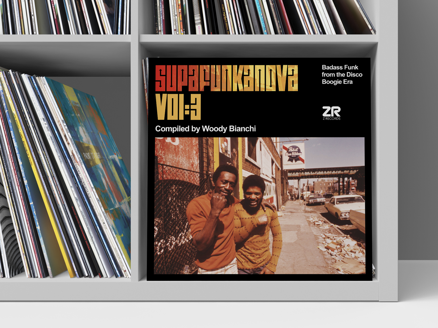
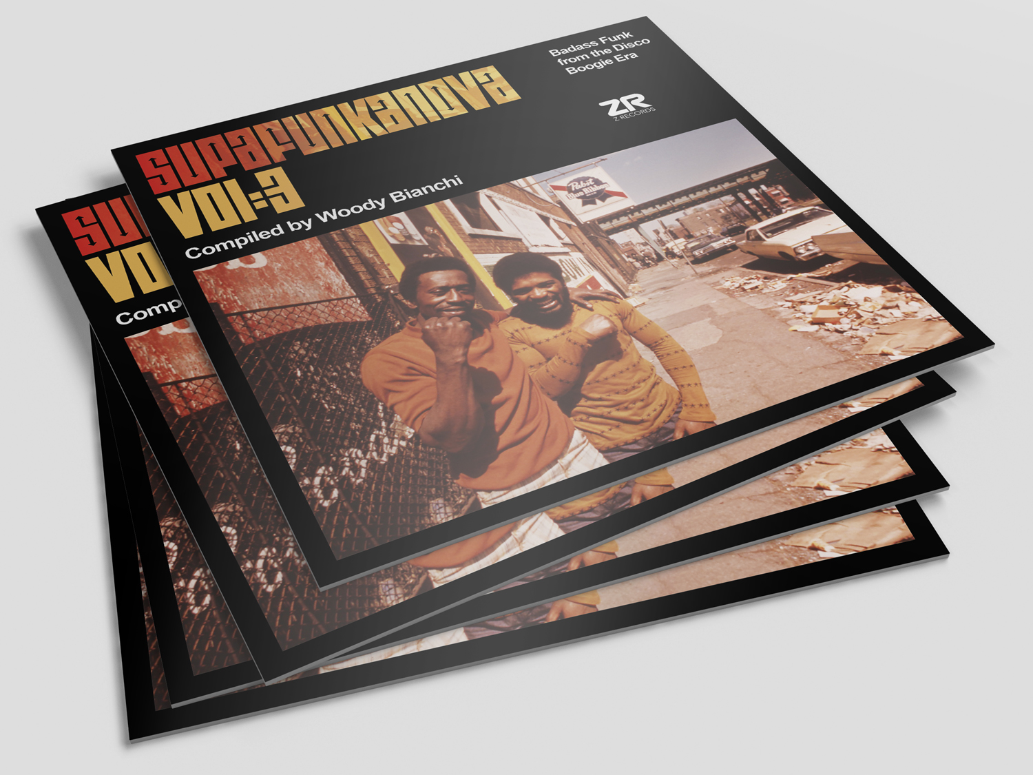
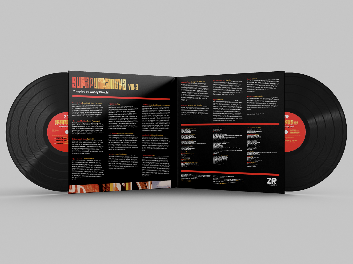
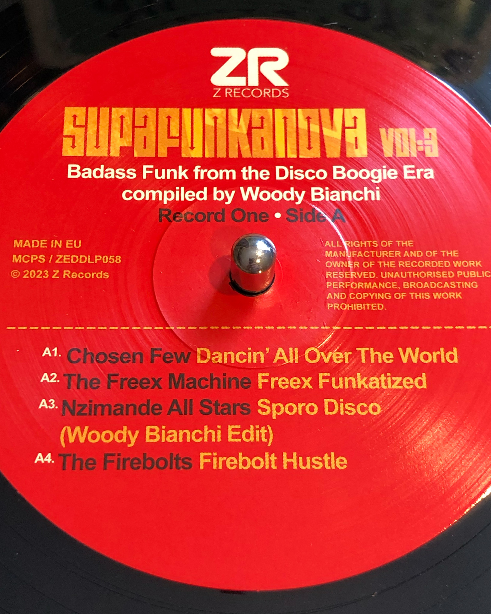
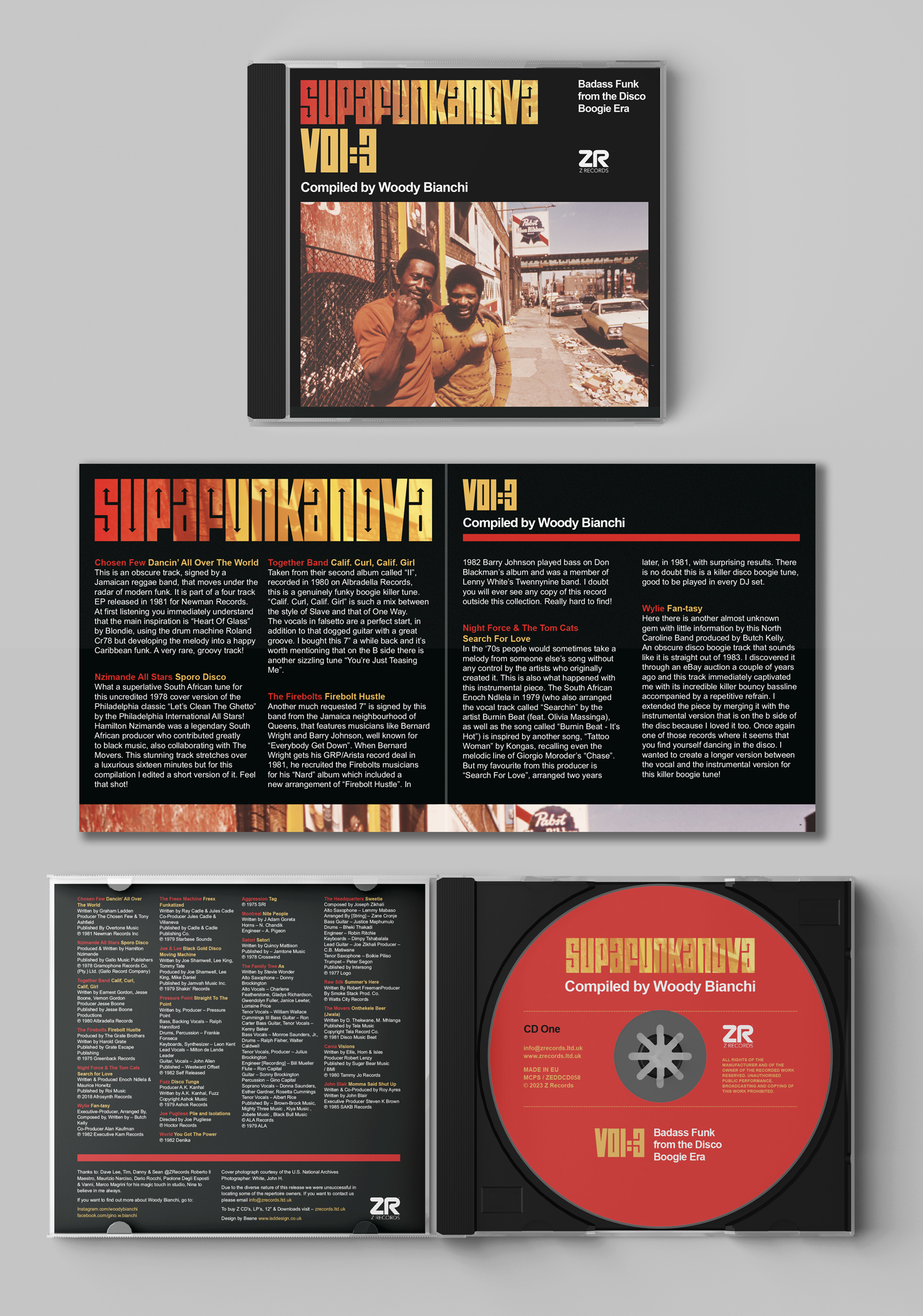
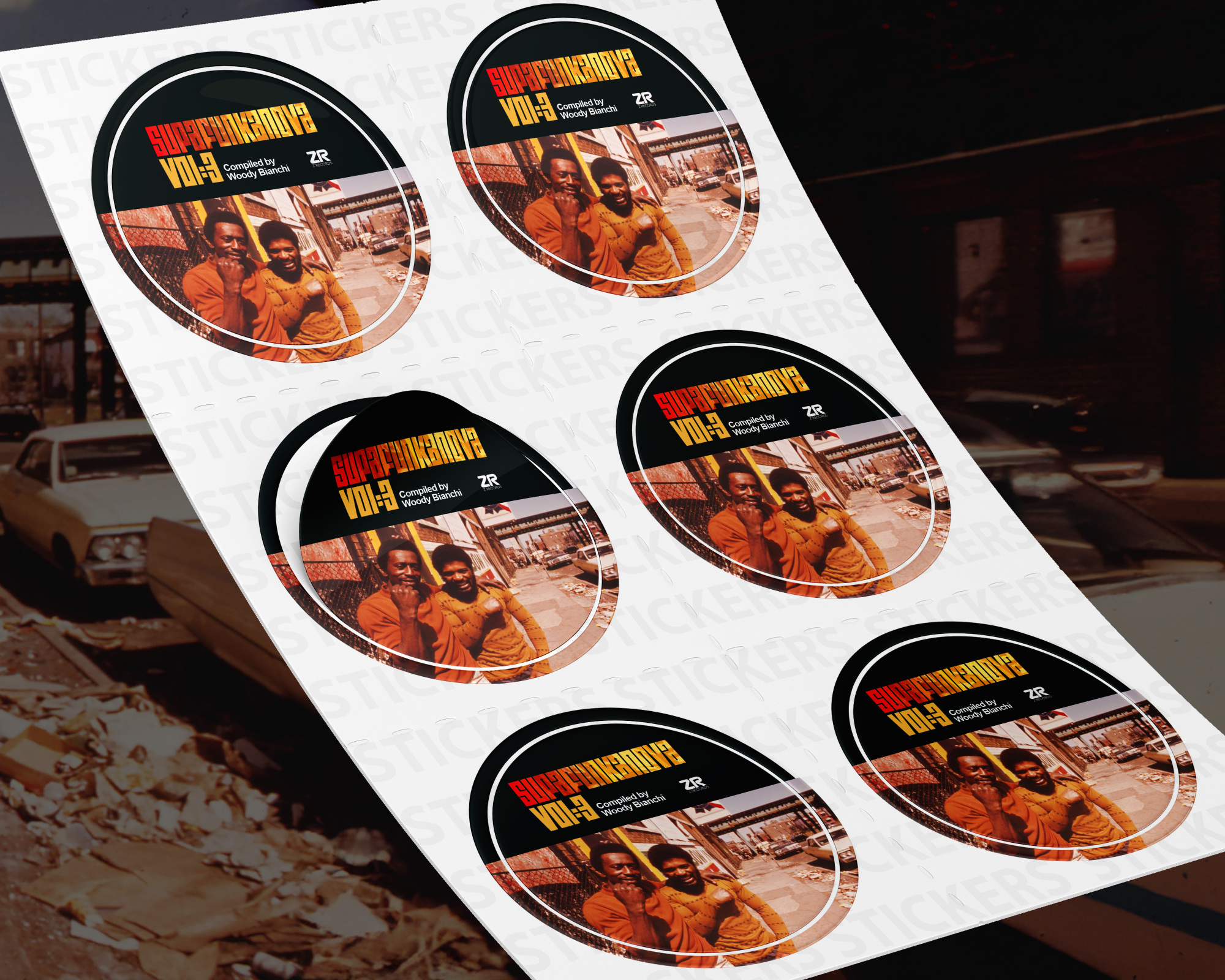
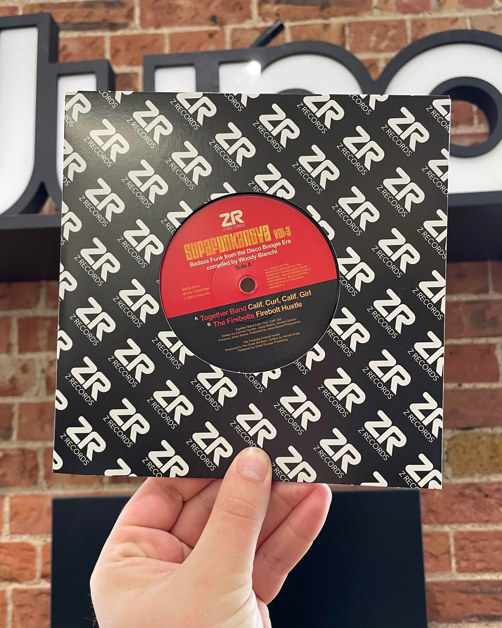
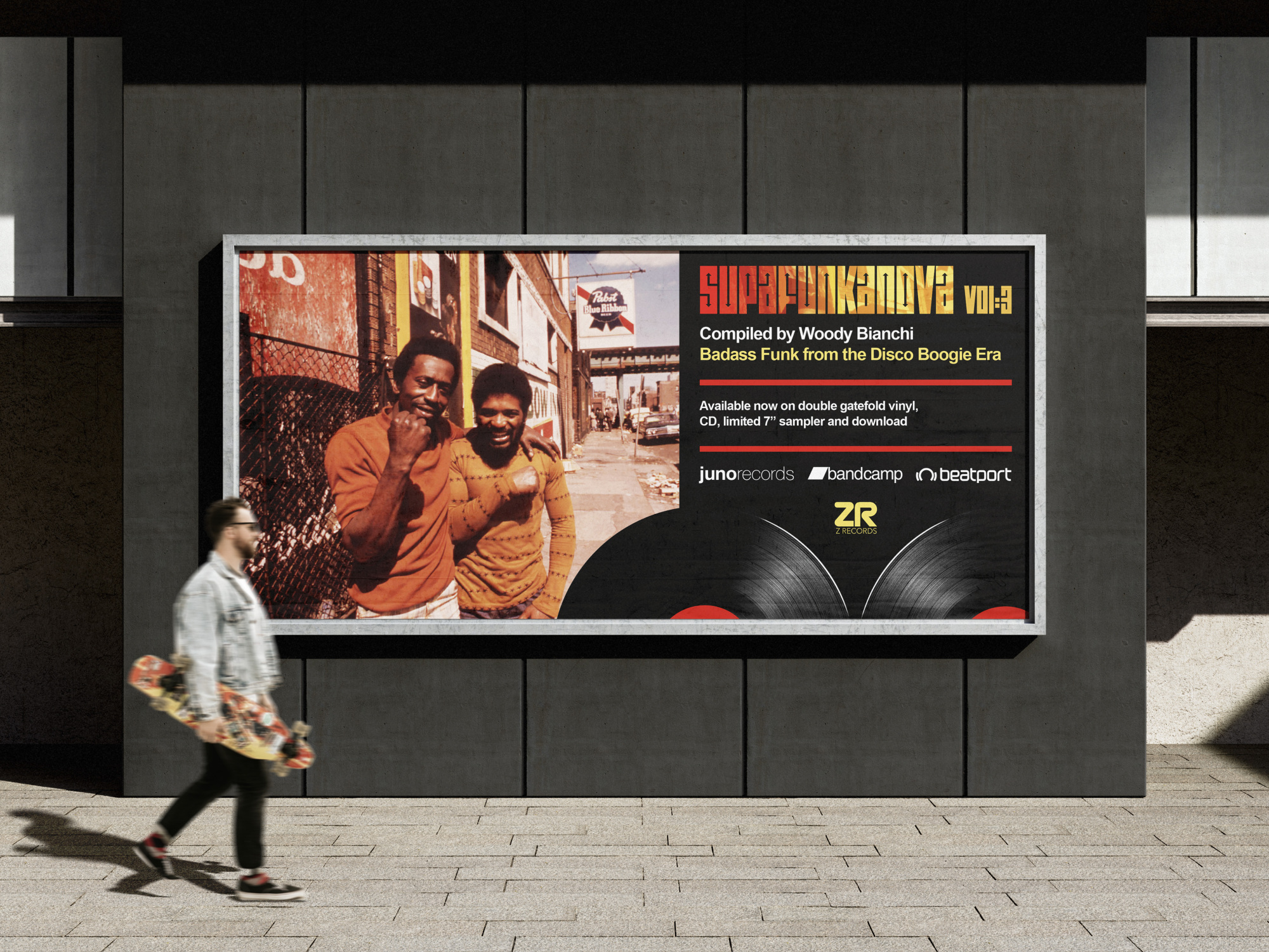
London-based label Z Records required a new design for their ‘Superfunkanova’ compilation series that incorporated their strong brand identity while also illustrating the flavour of the music contained within through use of imagery, colours and typography. These compilations are well-respected for their commitment to unearthing very rare old releases and bringing them to a new wider audience so a strong visual look and feel was needed for the double gatefold vinyl, CD and 7” single.
SOLUTION
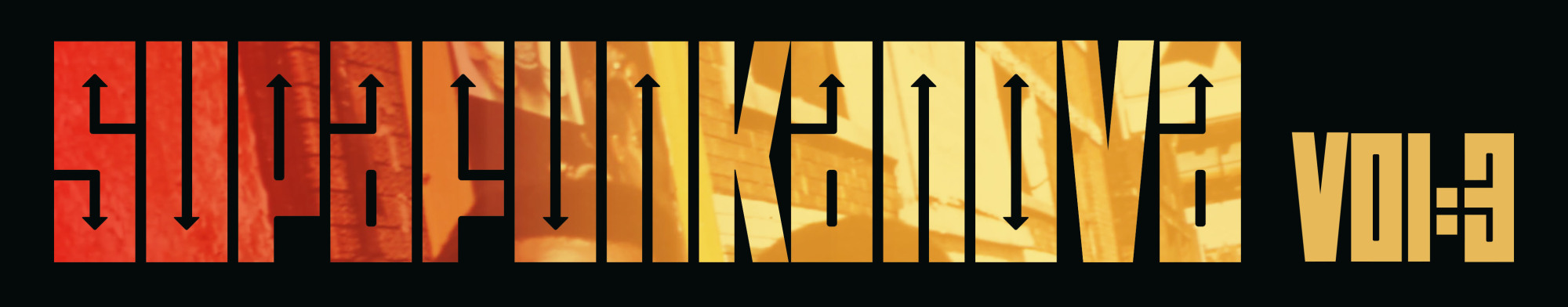
I sourced images relating to the era of 1970’s Chicago that encapsulated the vibe of the music the compilation contained. Warm colours were implemented throughout the design while adhering to the Z Records branding. To follow on from the print pieces, I also created an animation that was used for the promotional launch of the compilation for use across social media. The release was very successful and help to raise Z Records profile even further.